
Carats and Champagne: A Luxurious Identity That Feels Personal
Luxury is not loud. It is quiet confidence and exquisite attention to detail. With Carats and Champagne, the goal was simple and ambitious at once: build an identity that turns the promise of extraordinary living into a tangible experience at every glance and in every interaction. The brand speaks to a discerning client who wants creativity and personal connection as much as access and convenience.
“‘Transforming ordinary to extraordinary.’ The line became our north star and informed every decision from palette to typography to the tactile moments in print.”
Client at a GlanceCategory: Luxury concierge and lifestyle design
Audience: Affluent clients ages thirty to fifty five who value creativity, refinement, and memorable experiences that feel personal and considered.
Goal: A timeless identity that balances heritage with a modern point of view and scales across membership, events, travel, and home services.
Strategy snapshotClarify positioning. Lead with creativity plus concierge to differentiate from purely luxury-access services.
Design for emotion and trust. Build a system that feels intimate and considered, not ostentatious.
Create a toolkit that scales. Develop a logo suite, pattern, and type system that work across digital and print, large and small.
Visual Identity
Color storyMajestic Onyx — depth and presence for hero moments and typography
Bronze Prestige — warmth and glow that signals invitation rather than distance
Sable Elegance — quiet restraint that lets texture and form take the stage
Champagne Mist — soft neutrals for air and light
The palette is a family of nuanced earth tones that signal refined taste and longevity rather than trend. It supports both high contrast statement pieces and gentle, atmospheric layouts.
TypographyQuattrocento carries the brand voice in headlines with timeless poise.
Montserrat keeps long-form reading effortless and modern.
Termina supports UI and micro text with clarity.
Hopeless Romantic Society adds an intimate accent for select moments.
Together the stack balances heritage and contemporary ease.
Logo suiteA confident primary mark pairs a bespoke emblem with a classic wordmark. The emblem layers a diamond motif with mirrored letterforms to form a monogram that suggests craftsmanship, personalization, and a complete luxury experience. Secondary, icon, submark, and monogram variations provide options for small spaces, stamps, and social avatars while preserving recognition.


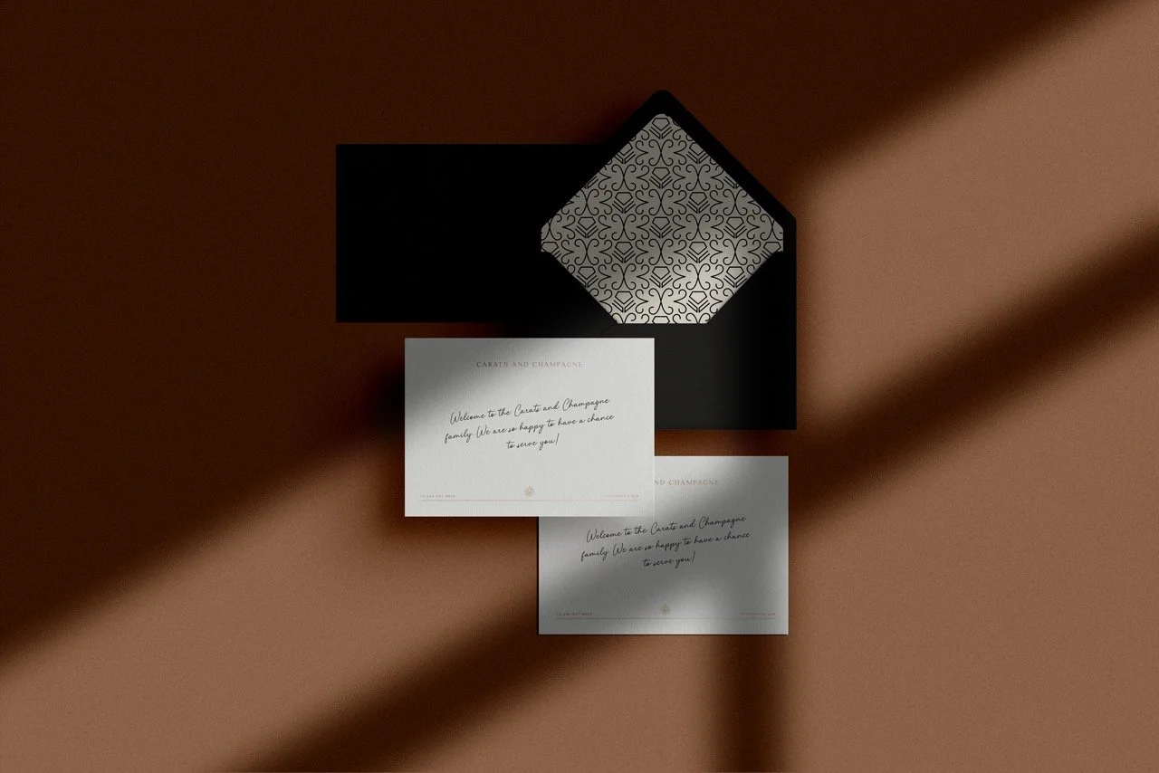
Brand in contextThe identity was designed to be felt as much as seen. Think embossed stationery, ribboned invitations, and textured cards that catch the light, paired with a digital system that moves with gentleness and intention. On screen, the palette and type create calm, high-contrast reading with room for imagery to breathe. In print, foil and tactile stocks heighten ceremony and keep-sake value.
Before and AfterBefore, the brand had vision and a clear promise but no visual system to carry that promise into the world. After, the identity delivers a unified experience from social to stationery to site, with a palette, type stack, and logo suite that work together without noise. It feels like a lifestyle you can step into rather than a logo you simply look at.
The ExperienceEnquiry → Discovery → Design → Launch
We framed the engagement around emotional outcomes first, then translated those into strategic choices and design assets. The process invited collaboration and clarity while preserving a sense of ceremony that aligns with the brand’s world.
Results that matterClearer positioning that blends concierge with creativity and lifestyle
A system that scales across events, travel, membership, and home services
Confident sales conversations with visuals that speak for the experience

The Rye WayWe blend strategy and aesthetics to craft identities that invite trust and spark connection. Every choice serves a goal, from the gravity of Majestic Onyx in a headline to the softness of Champagne Mist behind a story image, to the way a monogram seals an invitation. It is a system that guides feeling and action in equal measure.


